
Vanguard Product Design
Role: Senior Product Designer (Contract)
team: 1 designer (me), 3 engineering teams, 1 copywriter, 1 Head of UX
Partners: Lippincott, Spark
ReleaseD: January 2022 and beyond
Vanguard is the most trusted name in finance. But over the past few decades their website has not kept up with the best design standards and practices. They partnered with Lippincott and Spark to create a new brand direction for the company. I joined this project to integrate this new branding system across the retail marketing area of the site (the site that’s visible to personal investors before they log in). There were also many opportunities to improve usability, monetization, and accessibility.
Project 1: Investor Questionnaire
The goal of this basic questionnaire is to create a personalized investing strategy for current or potential Vanguard clients. During this redesign, my goal was to increase the percentage of people who completed the quiz as well as the percentage of quiz-takers who opted to open a Vanguard account.
I conducted a competitive analysis of existing quizzes and took those learnings to improve Vanguard’s quiz. I halved the number of clicks required by users, showed their progress as they completed questions, optimized the layout for mobile audiences, and improved typographic hierarchies on the results page.
Before the redesign
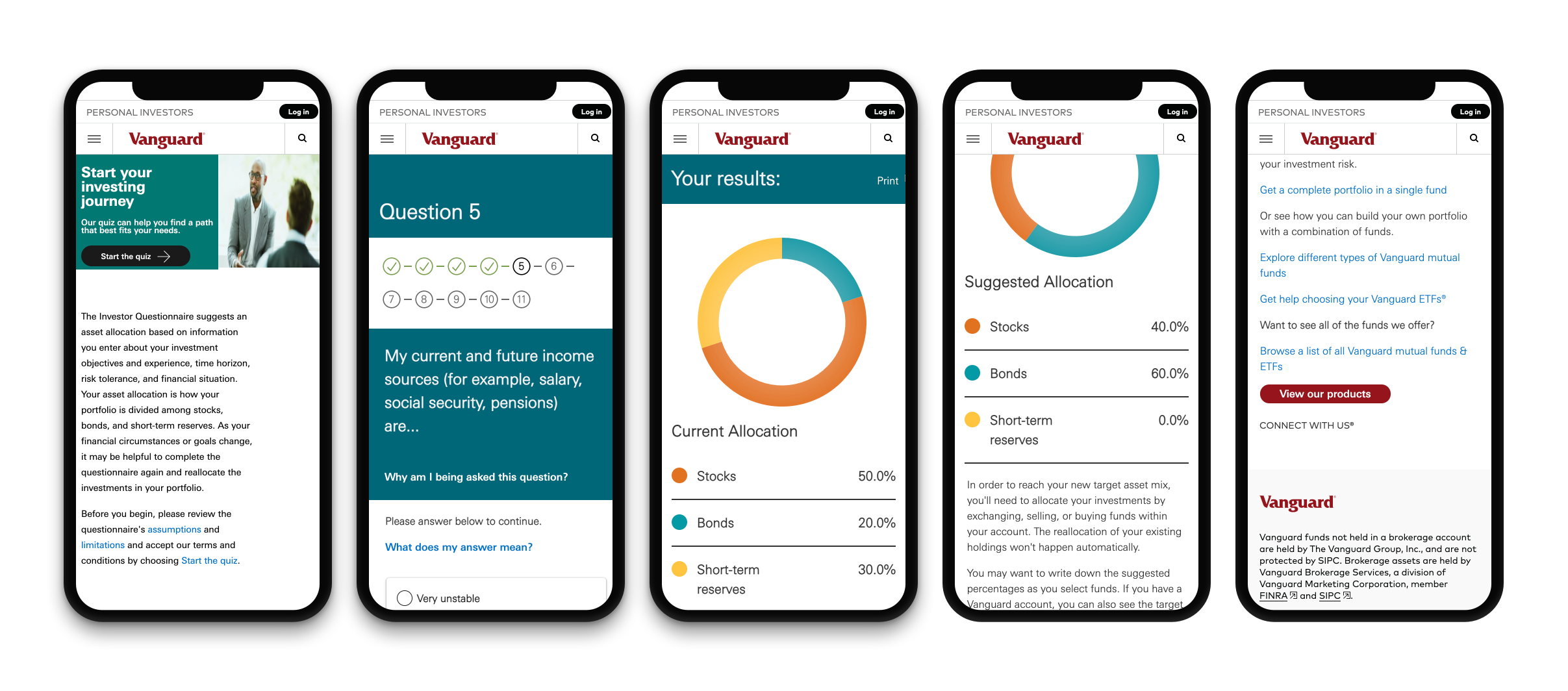
After the redesign

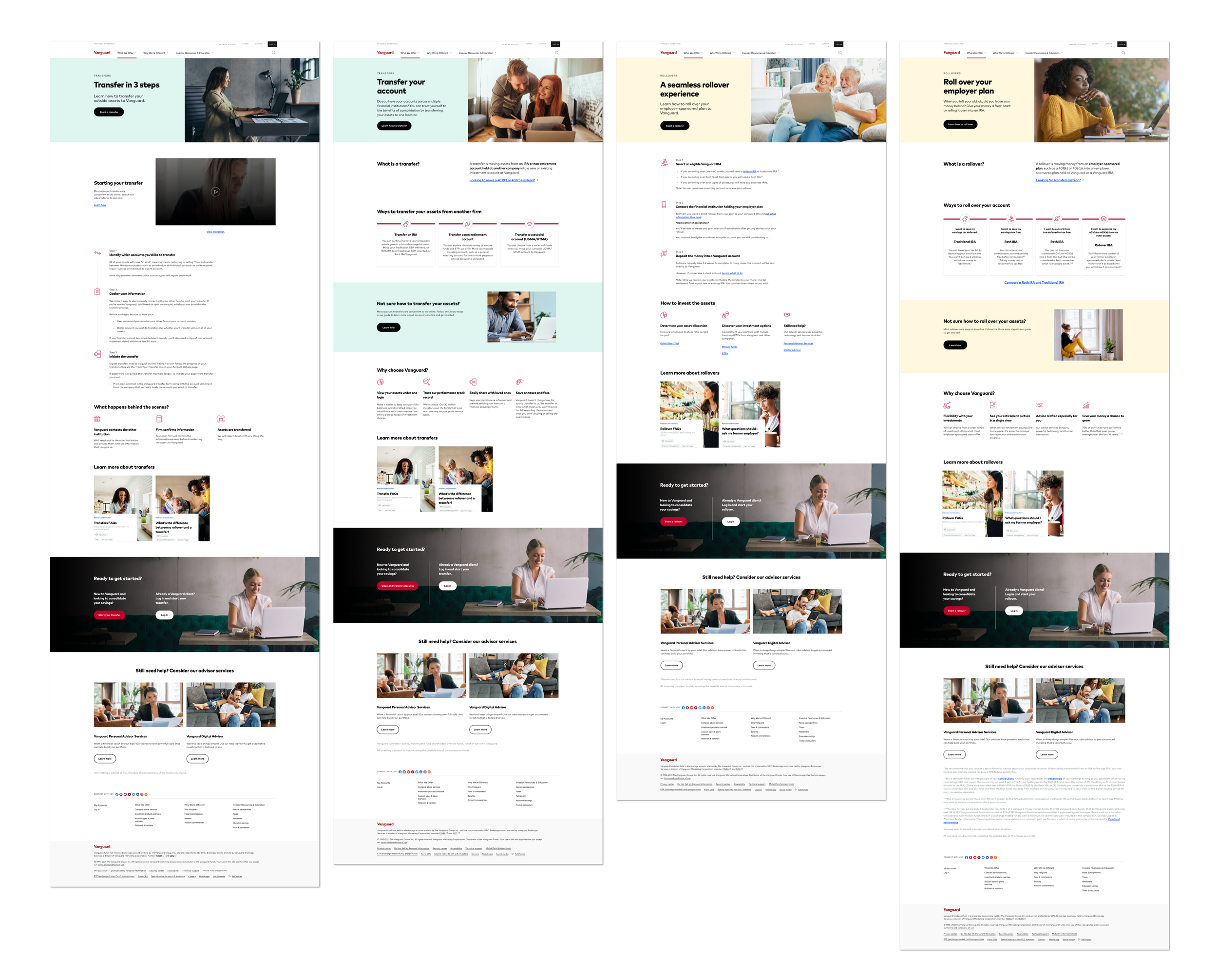
Project 2: 401k Rollovers and Transfers
We aimed to create a cleaner experience that engendered trust from existing and prospective clients. The pages also needed to provide clearer information to reduce the number of calls to Vanguard’s transfer helpline.
I collaborated with a strategist and a copywriter to develop an improved structure for these pages. Then, I adapted elements of our design component library to build pages with better hierarchy. The final suite of pages are estimated to save Vanguard millions of dollars each year in reduced call center costs.
Before the redesign

After the redesign
Project 3: News and Perspectives
The goal was to overhaul every article hosted on Vanguard’s website. We needed to be much more competitive in the landscape of educational financial content. I also saw an opportunity to improve recirculation and conversion after comparative analysis.
After reviewing Vanguard’s existing page and comparing it to competitors, I defined additional goals: to improve recirculation throughout Vanguard’s site and to increase conversion to Vanguard’s products and tools. I prototyped several different options and consulted with design leadership about ways to increase conversion, which they integrated into their larger strategy. My template was eventually launched across more than a hundred articles, thereby increasing account openings and facilitating better engagement with younger audiences.
Before the redesign

After the redesign
